Posted by: Pdfprep
Post Date: March 18, 2021
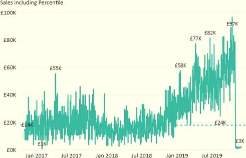
You plan to create the chart shown in the following exhibit.

How should you create the dashed horizontal line denoting the 40th percentile of daily sales for the period shown?
A . Create a horizontal line that has a fixed value of 24,000.
B . Add a measure to the visual that uses the following DAX expression.
Heasurel – PERCENTUE
C . EXC (Sales,Sales[Total Sales],©.40)
D . Add a new percentile line that uses Total Sales as the measure and 40% as the percentile.
E . Add a measure to the visual that uses the following DAX expression.
Heasurel = PERCENTILE
F . INC (Sales,Sales[Total Sales],6.40)
Answer: C
Explanation:
The analytics feature enables you to show percentiles across groups specified along a specific axis.
Example:

Leave a Reply